Search This Blog
Sunday, 13 April 2014
Saturday, 12 April 2014
Friday, 11 April 2014
Evaluation
For my A2 Media portfolio, I had to produce and develop a music video along with a magazine advertisement for the video and a two disc digipak for the album.
After doing this research, I reached the following conclusions:
"The story of an individual who is embarking in a long thought process. Feeling confined he starts on an aimless walk to clear his head and goes a long distance. Interweaving with this story line is the tale of another character (antagonist) who receives a message with a picture of the other man’s face, he then starts preparing himself to go and kidnap the man. As both narratives progress through the story, they collide and the walking man is dragged into a van and taken in to the distance. He is brought to a desolate, abandoned location and then the camera fades out."
----------------------------------------------------------------------------------------------------------------------------------As I had established what basic conventions I had to include in my video to successfully appeal to my audience, I formulated an animatic storyboard and shot list to give me a firm foundation of what i was to film:
Analysis of convention use in my video:
Lower Angle looking at antagonist getting ready: slow motion
This shot was used to create emphatic stress upon the dominance of the antagonist, representing him as superior to the protagonist. The fact that shots are in slow motion when on the antagonist and not the protagonist creates the sense of two completely different interweaving worlds.
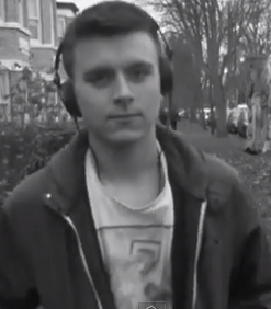 The shot on the left shows the antagonist smoking cannabis, with a cross placed on a church above his head. This reflects the fact that despite him taking part in a deviant illegal activity, he is still an innocent bystander, building a stronger emotional bond between the viewer and character, making the audience care about him more.
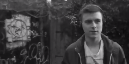 Several shots included feature graffiti on walls and fences enforcing the class of the protagonist and the area in which he lives.
Track shot of protagonist walking with antagonist approaching in the background:
This shot builds great dramatic tension in the video as it shows the point where the two interweaving storylines finally collide. The lamppost in the top right corner is also used to show the protagonist leaving the comfort of the light and entering the dark unknown.
Still shot of protagonist with van and characters fading out:
To create the fading out of the characters, the camera had to be placed firmly in its place. The shot with characters was then filmed, and after, the van and characters moved out of the scene. The landscape was then filmed so during editing when the characters faded out, the scenery would remain the same.
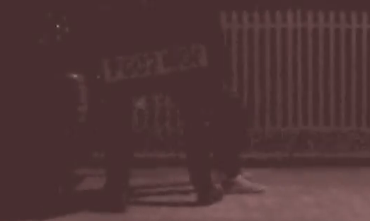 There are also a few shots within the video that possess a red tint. This was to reflect the danger that the protagonist has encountered and express his panic as well as the aggression of the antagonist.
During the second chorus the editing of cross cuts speeds up to show numerous things that have already occured in the video, providing a small summary of events so far. Following this, the previous interweaving storylines collide when the antagonist strikes the protagonist over the head with a plank of wood. Both characters have been shown to travel a great distance up until this point, which greatly increases the narrative and audience/character relationship. A red tint is then introduced to show the panic and anxiety of the protagonist and the aggression and fury of the antagonist as he drags him into the van. The van door is then shown closing to connote the locking away of the protagonist.
After this shot, there is one long sped up shot featuring many lampposts passing by on a motorway, followed by another long sped up shot driving down a dirt path. Not only does this display that they are leaving the inner city to go somewhere quiet, leaving the protagonists comfort zone, but also demonstrates just how far they have travelled. Next, the van drives up to the camera and stops, indicating that the journey has come to a close. The protagonist is then dragged to the front of the van and placed on his knees looking scared. With the fate of the protagonist still unknown, the antagonist comes and stands beside him with a hammer in his hand to imply the murder of the protagonist. The camera and characters then fade out to show the '1 new message' shot that featured earlier in the video to suggest that the antagonist has done this before and will do it again. I decided to end the video like this because i thought it would seem more shocking to the audience than a happy ending and make a lasting impression.
----------------------------------------------------------------------------------------------------------------------------------
Ancillary Texts:
Before creating my ancillary texts (a magazine advertisement and a two disc digipak), i first had to research the conventional features of these media texts. That way, I could depict the most successful and common features that created a successful advertisement. took images out of my filming to help create continuity throughout all products. This would create a more common theme and provide the sense of a house style. I had to design and produce a two disc digipak and a magazine advertisement for the track i had made a video to.
I created both of these on Adobe Photoshop, with pictures from my video. To bring a new element to the pictures, I used the website www.dafont.com to add unique text to my media pieces.
Before making my magazine advertisement i first looked at existing ones, then observed and determined what they had in common:


Then through development and editing, with the addition of cropping, effects such as blur, a few drafts and the involvement of text courtesy of www.dafont.com, I created a magazine advertisement that i felt continued the urban, yet contemporary theme of my music video.
Final draft of magazine advert
I needed to ensure that my ancillary texts blended well with my music video. After numerous drafts, I decided to take screenshot from the original video. When this shot features in the video, it is in black and white, i felt however that having a black and white magazine advertisement, would fail to catch the viewers attention and appear dull and mundane. Therefore I added the colour back to the picture and turned up the contrast making it stand out greatly, especially the light of the cigarette he is smoking. The fact that the advertisement is a shot that is featured within the video creates continuity and the effect of a house style between all products, successfully appearing that they are all from the same institution.
I felt that blurring out the characters face would create a sense of nostalgia and mystery, making the advertisement more interesting and appealing. I also decided to make the advert look as aesthetically interesting as I could, whilst containing minimal information on it. Therefore the consumer would be provided with just enough information about it to know what it is, and how to find out more information, making them take a deeper interest in the subject rather than displaying all the information on the advert, so they wouldn't have to look any further. I also decided that the font on the advertisement had
to be visually powerful. I visited www.dafont.com to search for a font that not only looked impressive but also reflected my chosen genre. I chose this font as i felt that the roughness of it supported the urban, street style that i wanted to convey. To add to the apparent urban, street theme, I position the text over the protagonist's eyes to give the impression that his eyes were scratched out. Not only does this represent the ending of the video when he is implied to be murdered, but also adds a sense of mystery to the advertisement, which is enforced by the blurred out character and limited information. The use of the Domino Records Label is used on both ancillary texts, creating continuity and adding to the house style. It is also the record label of Arctic Monkeys who wrote the song i chose to utilise for my video.
Final draft of two disc digipak
For my digipak, i wanted to continue the urban street theme that was in my other products. That way i could create more continuity and make them all look like part of the same institution and product. To maintain the street theme, I took numerous shots of city streets, lampposts and scenery from around Hull. Both discs feature images of lampposts, modified to have black around them. All images on the inside of the digipak feature a form of light, either van or lamppost. I thought that showing three different forms of light that could be found on the street would enforce the urban theme. The bottom left image is the same image as the one i used for the magazine advertisement creating continuity and a house style. The bottom middle image, is of a street path, reflecting the audience's suggested living environment and the bottom right is of a busy street (Spring Bank) blurred to create the sense of nostalgia. I feel that all of these successfully maintain the style that i have attempted in my other products and produce continuity throughout all products. I decided that the text that i used on my magazine advertisement was effective in a small dose, but could prove had to read when used all over a digipak. Therefore, using www.dafont.com again, i found a font that was noticeably different, but still maintain the alternative rock/indie vibe.
I feel that my music video, magazine advertisement and digipak are all easily distinctive as part of the same package and are very successful together. They contain aspects my targeted audience desire to see within these types of products.
----------------------------------------------------------------------------------------------------------------------------------
After my products were through the drafting stage and fully completed, i present them to various students and teachers. Feedback from other students and some teachers informed me that certain scenes were too dark, too long or of a poor angle. I noted this feedback and evaluated my video and after much dedication and deliberation i was able to work on the issues raised and develop them to a better standard. Through feedback and self evaluation i was able to determine what aspects of my video I would modify if I was to create another video. I made changes to scenes such as when the antagonist receives the first text message as this shot was deemed too long. This was also the issue with the shot of the van light igniting. So i cut these scenes down to a more suitable length. Apart from these particular scenes i had received suitably positive comment about my video and ancillary texts, which lead me to believe they were successful. However, if I were to re attempt a music video, I would put more thought into involving more props in my video, as well as a larger variety of shots in regards to cinematography. I used shots such as track shots and still shots, but failed to explore shots such as pan, establishing and long shots. I would also experiment with and utilise a larger spectrum of angles as i focused mainly on eyeline match, low angles and cantered angles.
But during the process of editing, I developed a large amount of skills. Not only on my music video but on my ancillary texts too. Whilst editing the music video on the iMac video editing suite iMovie, I had to ensure that all cross cuts and transitions were synchronised accurately with the beats of the music video. This took a lot of time and effort as i had to insert and cut clips with exact precision, so the clips would cross cut at the perfect time. I was also new to adding transitions into videos, this allowed me to explore and develop in an area I was not previously accustomed with. I gained an understanding of how to utilise transitions to effectively change the impression provided by the video. A transition can be used to modify the mood of a scene by making it merge smoothly into the next. the transition I utilised most was the 'Cross Blur' affect which was used predominantly when the antagonist was featured in the scene to enhance the sense of confusion with his intentions and reflect his deranged mindset. I also experimented with the contrast, depth and saturation modifications which allow the user to apply different colours to the scene being edited. This was particularly useful to me as I had planned the first half of my video in black and white, requiring me to bring the contrast and saturation to a largely lower level. I also used this in the scene when the antagonist strikes the protagonist with the wooden instrument. This is the first time that colour is introduced into the video, i thought that by doing this it would emphasise the drama of the two story lines clashing. The red tint is also used in the scene where the protagonist is dragged into the van to convey both characters emotions. iMovie also allows the user to slow down or speed up footage, a tool that I used numerous times within my piece, either to emphasise drama or progress the narrative. iMovie also provide a vast array of sound effects. I incorporated the 'Tape Rewinding 01' sound effect at the beginning of my video to show the audience that the narrative is rewinding from the start to play again, a small but useful effect.
I also used the Adobe program Photoshop for my ancillary texts. This program allows the application of effects, cropping, cloud adjusting and multiple other tools to modify photos. Whilst using this program I became accustomed with several skills that allowed me to effectively produce the type of text i desired. Due to my development in adjusting colour on iMovie, I became aware of how to modify the colours of my magazine advert to my advantage. So i increased the contrast and saturation to a small degree in order to make the colours more vibrant and therefore more likely to catch the viewers attention. Another tool I ended up using a lot was the blur tool. I firstly blurred the main images of my digipak and advert, then following this I added text from dafont.com. But, due to the blurring of the background, and the sharpness of the text i had imported, the text seemed to stand out to a large degree. I decided that to avoid this I would blur the edges of the text, creating a greater blend between background and text, making all of the products carry the same basic features and successfully maintain a house style.
For my product, I chose to use the song Fireside from the album AM by the band Arctic Monkeys.
This song falls within the category of alternative rock/indie music and therefore has different conventions and expectations to other genres such as pop, metal and house. Therefore for me to successfully address and appeal to the target audience of this genre, I had to ensure that it possessed the correct features, connotations and conventions that the audience expected and wanted to see.
As I had never before planned or produced a music video I did some research into the history of music videos.
As I had never before planned or produced a music video I did some research into the history of music videos.
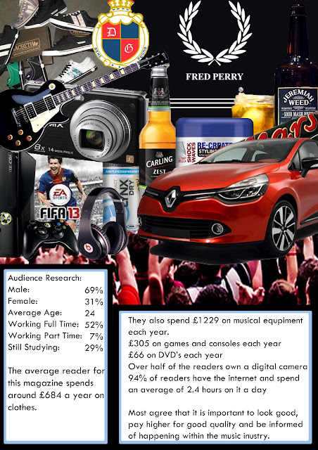
A fraction of my first year of Media Studies was spent doing research into the audiences of alternative rock for features to include in a music magazine, so upon starting this assignment i already had a basic knowledge of what the audience were expecting. I had also designed and produced the following audience demographic:

This helped me identify my audience's interest and hobbies, giving me a more in depth understanding of who they are and what they do. It didn't however, provide me with information of what form of music video they preferred and what they expected to see within it. Therefore I researched the editing, mise en scene and cinematography features in existing music videos of this genre, to see what they included so i could include things that my audience could relate to.
1.
2.
After doing this research, I reached the following conclusions:
- My video should be of the narrative form
- It should include a protagonist and antagonist
- It should have an unconventional ending
- The costume for the protagonist should be that of my audience, (casual clothing)
- The costume of the antagonist should contrast greatly to the costume of the protagonist.
- The majority of settings within my video should be city streets
- The above video is 'Why'd You Only Call Me When You're High' by Arctic Monkeys, which i decided to use as my model text. This video features the apparent protagonist, Alex Turner, who is also the lead singer of the band, making a journey from a pub to a girl's house after a night out. On his journey he encounters numerous obstacles that he finds difficult to overcome due to his intoxicated state from alcohol and drug abuse. I found that showing the main character of the video making a journey was a very effective way to build up a relationship with the protagonist, making the video more interesting and appealing. Therefore i decided that my video would show the main character making a journey, so the audience would have time to see him progress and eventually build a personal relationship with them, linking to the personal relationship aspect of Blumer and Katz' Uses and Gratifications theory. It could also link to the diversion aspect of the Uses and Gratifications theory as people like witness media texts to offer alternate realities to their own, which can be provided through a music video narrative.
To gain a more in depth understanding of this video i did an in depth analysis of all of its factors…
"This video initiates with a track shot of the lead singer, Alex Turner, leaving a pub intoxicated in the early hours of the morning and gradually making his way towards a girls’ house whilst texting her without a reply. But on the way, due to his mental and physical state, visualises many things that aren’t there and encounters many other characters that are considered as antagonistic. The cinematography featured within this music video is quite shaky, creating a handheld feel , that depicts the state that the character is in. This shows that he isn’t in a functional state of mind to function to the standard of a sober individual, this also reveals connotations of rebelliousness and deviance that is primarily perceived as working class behaviour. The camera proceeds to follow Alex on his entire journey, in regards to cinematography the camera seems to predominantly use a track mid-shot to create the sense that he is progressing on his journey and that the narrative is progressing also. The editing within the video is rather consistent in it’s form, it includes only cross cuts, from Alex to the events that are occurring and the other characters featured in the story, showing us what he is experiencing. This, as well as the video being shot during the night time creates the sense that danger is imminent and anything could happen at any given time.
The state that Alex is in, makes the viewer see that he is in fact highly vulnerable to these circumstances. There is also regularly cross cuts to Alex’s hallucinations in which the focus of the camera is distorted, enforcing the fact that he is intoxicated and visualising these occurances. In regards to conventional attributes, this video carries a strong urban theme, and supports the ideology of the working class regularly getting drunk and wandering the streets at the early hours of the morning.
This video also defies stereotypical conventions, as the standard convention for narratives including a boy and girl state that at the end of the video, they will meet and live happily, but in this video, the main character has simply had too much to drink and can't think clearly. On his way home, he is confronted and interacts with other characters that are portrayed as ‘antagonists’ as they give him trouble on the way home, giving the narrative a more defined conventional story. Alex's costume within this video features a black leather jacket and skinny jeans, as well as these items of clothing being identified as indie, they also carry connotations of deviance and rebelliousness.
The ideology of him being a rebel is enforced by his intoxicated state, and how confrontational he gets with pedestrians on his journey. I would personally state that the targeted audience for this piece is the working class who are represented as regularly getting intoxicated, getting themselves into trouble and making poor choices, the title of the song alone enforces this also, the music however is targeted to audiences that enjoy alternative/indie rock music. The conventions of this genre are presented strongly and boldly throughout the video, them being the urban setting, the dark coloured clothing and the characeters that appear on the street at the time the video is set. The ideology behind the video appears to be representing the artists as working class 'Sheffield' lads, showing that despite all their fame they still consider themselves, and act like normal working class men in a working class environment.
The classic Hollywood convention of boy meets girl, boy gets with girl is broken in this video however as Alex is so intoxicated that the video results him in mistaking his girlfriend's house for an elderly old ladies' house.
The video successfully represents Alex Turner (Songwriter/performer) as a working class man, living a working class life, which is the lifestyle that the macro audience of this music live. The representation and ideology of this video is a strong link to the theory of Marxism regarding media, as it shows people of the working class (proletariat's) getting wasted and being deviant. This matches the theory as it states that the working class are primarily demonized for being the members of society who drink and engage in deviant activities."
----------------------------------------------------------------------------------------------------------------------------------
Conventionally, music videos with a narrative feature a protagonist and an antagonist to develop more of a storytelling structure. Theorist Levi Strauss stated that narrative forms rely on the conflict between two binary opposites of good/protagonist (the character the audience supports) and the evil/antagonist (opposition to the protagonist). Therefore i decided to use the conventional involvement of protagonist/antagonist used in real media products. I eventually crafted three optional story lines which i would work on a decided work on the following:
"The story of an individual who is embarking in a long thought process. Feeling confined he starts on an aimless walk to clear his head and goes a long distance. Interweaving with this story line is the tale of another character (antagonist) who receives a message with a picture of the other man’s face, he then starts preparing himself to go and kidnap the man. As both narratives progress through the story, they collide and the walking man is dragged into a van and taken in to the distance. He is brought to a desolate, abandoned location and then the camera fades out."
----------------------------------------------------------------------------------------------------------------------------------As I had established what basic conventions I had to include in my video to successfully appeal to my audience, I formulated an animatic storyboard and shot list to give me a firm foundation of what i was to film:
The
video opens with a rewinding tape sound effect, accustomed with sped up,
rewinding film. This instantly lets the audience know that the video is of the
narrative form. It tells the story of a young man (the protagonist), who
starts on a long walk and bask in a seemingly long, deep thought process. The first half of
the video is edited to be in black and white, enhancing the urban street
backgrounds to look duller, enforcing the working class of the protagonist and the rough area
in which he lives. The protagonist had a specifically assigned costume; a white
t-shirt to connote innocence and purity, providing the viewer with an opportunity
to connect to the character. A hooded casual jacket was worn to reflect the
audiences’ interests as my main audience are the working class and they are
most likely to wear casual clothing rather than suits and trousers. It was for
this reason the protagonist was also wearing jeans and trainers. The working
class are statistically proven to be more likely to commit crime and commit
deviant behaviour. This lead me to formulate a shot of the protagonist smoking cannabis, to reflect the ideology that demonises the working class.
This links with Tim O’Sullivan Et Al’s theory of ideology and Karl Marx’s class
conflict theory which states that ideology is created by those in control and
then spread through the media leading everyone to believe that the
representation created is the ideal. This also links with Tim O’Sullivan Et Al’s ideology theory and the Hypodermic needle theory which states that certain beliefs and
attitudes are injected into us unknowingly through the media, leading us to unconsciously
take on judgements of stereotypes. At the start of the video, the protagonist puts
on a pair of headphones to initiate the music. As well as providing an
effective opening to the video, the use of headphones reflects the viewers’
interest as my audience have a profound love for music. There is then multiple
cross cut edits of the protagonist walking in different locations, but the
frame is in the same position, providing the effect that the background is
changing. As well as being aesthetically impressive, this provides the impression
that he is travelling further than he would of been if it was simply a track
shot, progressing the narrative further and creating the sense he has come a long way.
Following this, there is a cross cut to the interweaving storyline of the
antagonist. To effectively create the idea that he was in fact the antagonist
and the enemy of the protagonist, I made him completely different. The
antagonist’s costume consisted of all black, which is used to connote impurity,
evil and corruption. This way the audience could easily identify the use of
binary opposites as explained by Levi
Strauss. To create a larger sense of evil within the antagonist, every shot
in which he is features is edited to use slow motion, creating emphatic stress
on each and every one of his actions. The antagonist is shown receiving a message and then prepares to do something, which implies there is a third character within the narrative. It also implies that the antagonist is merely acting under the command of someone else. Each edit is precisely edited to be on
the exact beats of the song, creating a more fluent progression of the
narrative for the viewer as it fits specifically with the rhythm. As the
narrative progresses the protagonist and antagonist’s characters develop. We
see the protagonist walking through streets, smoking cannabis and listening to
music, whilst the antagonist appears to be preparing for something unknown to
the audience. The progression of my narrative went from daylight to night time, this made planning for filming crucial in regards to time. Shots on separate days had to be filmed precisely to ensure continuity within the narrative. As well as this several shots had to be extremely well placed:Lower Angle looking at antagonist getting ready: slow motion
This shot was used to create emphatic stress upon the dominance of the antagonist, representing him as superior to the protagonist. The fact that shots are in slow motion when on the antagonist and not the protagonist creates the sense of two completely different interweaving worlds.
Many shots included features such as flashing lights in windows, a person walking slowly behind him and a car tailing him. All of these features indicate danger and the fact that something bad is going to happen.
 The shot on the left shows the antagonist smoking cannabis, with a cross placed on a church above his head. This reflects the fact that despite him taking part in a deviant illegal activity, he is still an innocent bystander, building a stronger emotional bond between the viewer and character, making the audience care about him more.
 Several shots included feature graffiti on walls and fences enforcing the class of the protagonist and the area in which he lives.
Track shot of protagonist walking with antagonist approaching in the background:
This shot builds great dramatic tension in the video as it shows the point where the two interweaving storylines finally collide. The lamppost in the top right corner is also used to show the protagonist leaving the comfort of the light and entering the dark unknown.
Still shot of protagonist with van and characters fading out:
To create the fading out of the characters, the camera had to be placed firmly in its place. The shot with characters was then filmed, and after, the van and characters moved out of the scene. The landscape was then filmed so during editing when the characters faded out, the scenery would remain the same.
 There are also a few shots within the video that possess a red tint. This was to reflect the danger that the protagonist has encountered and express his panic as well as the aggression of the antagonist.
 During the second chorus the editing of cross cuts speeds up to show numerous things that have already occured in the video, providing a small summary of events so far. Following this, the previous interweaving storylines collide when the antagonist strikes the protagonist over the head with a plank of wood. Both characters have been shown to travel a great distance up until this point, which greatly increases the narrative and audience/character relationship. A red tint is then introduced to show the panic and anxiety of the protagonist and the aggression and fury of the antagonist as he drags him into the van. The van door is then shown closing to connote the locking away of the protagonist.
After this shot, there is one long sped up shot featuring many lampposts passing by on a motorway, followed by another long sped up shot driving down a dirt path. Not only does this display that they are leaving the inner city to go somewhere quiet, leaving the protagonists comfort zone, but also demonstrates just how far they have travelled. Next, the van drives up to the camera and stops, indicating that the journey has come to a close. The protagonist is then dragged to the front of the van and placed on his knees looking scared. With the fate of the protagonist still unknown, the antagonist comes and stands beside him with a hammer in his hand to imply the murder of the protagonist. The camera and characters then fade out to show the '1 new message' shot that featured earlier in the video to suggest that the antagonist has done this before and will do it again. I decided to end the video like this because i thought it would seem more shocking to the audience than a happy ending and make a lasting impression.
----------------------------------------------------------------------------------------------------------------------------------
Ancillary Texts:
Before creating my ancillary texts (a magazine advertisement and a two disc digipak), i first had to research the conventional features of these media texts. That way, I could depict the most successful and common features that created a successful advertisement. took images out of my filming to help create continuity throughout all products. This would create a more common theme and provide the sense of a house style. I had to design and produce a two disc digipak and a magazine advertisement for the track i had made a video to.
I created both of these on Adobe Photoshop, with pictures from my video. To bring a new element to the pictures, I used the website www.dafont.com to add unique text to my media pieces.
Before making my magazine advertisement i first looked at existing ones, then observed and determined what they had in common:
Therefore after analysing other magazine ads that are contained within the genre i am exploring, i will be sure to include the release date, name of song and artist, record label, the formats in which it will be available, all to ensure that i meet the expectations that my targeted audience have.
I then made two mock ups of my own magazine advertisement:

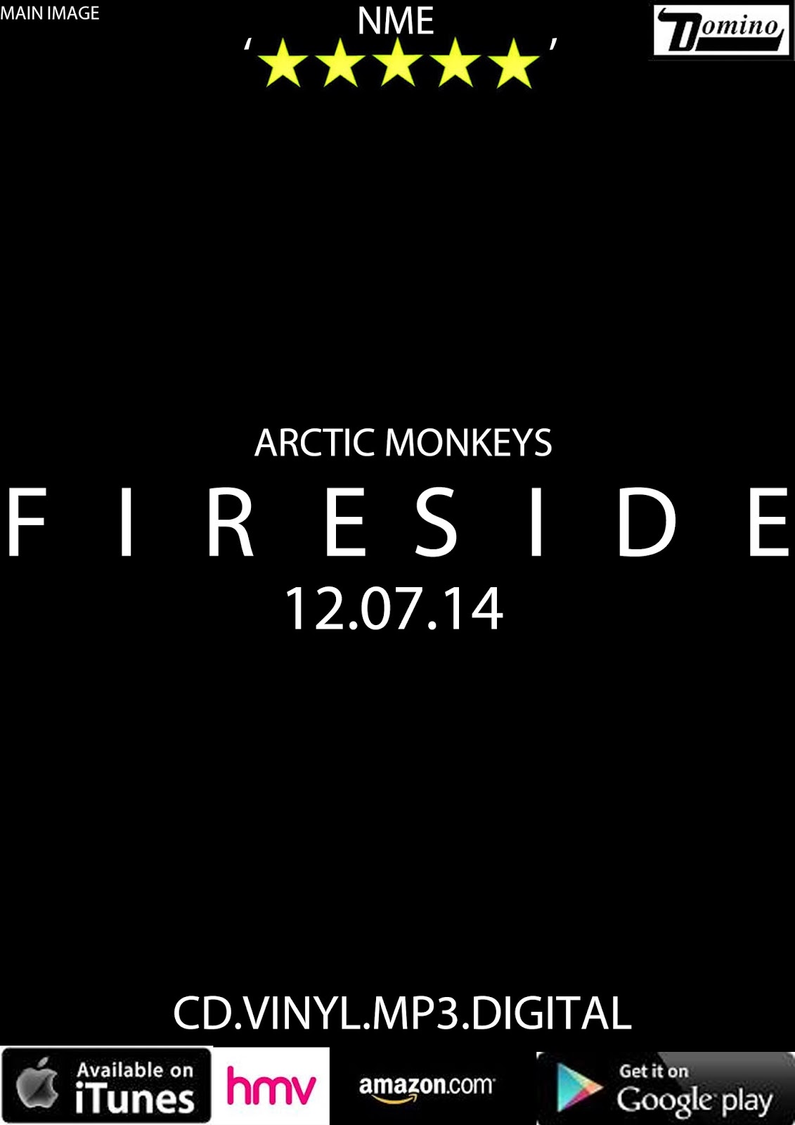
I then made two mock ups of my own magazine advertisement:


I felt that blurring out the characters face would create a sense of nostalgia and mystery, making the advertisement more interesting and appealing. I also decided to make the advert look as aesthetically interesting as I could, whilst containing minimal information on it. Therefore the consumer would be provided with just enough information about it to know what it is, and how to find out more information, making them take a deeper interest in the subject rather than displaying all the information on the advert, so they wouldn't have to look any further. I also decided that the font on the advertisement had
to be visually powerful. I visited www.dafont.com to search for a font that not only looked impressive but also reflected my chosen genre. I chose this font as i felt that the roughness of it supported the urban, street style that i wanted to convey. To add to the apparent urban, street theme, I position the text over the protagonist's eyes to give the impression that his eyes were scratched out. Not only does this represent the ending of the video when he is implied to be murdered, but also adds a sense of mystery to the advertisement, which is enforced by the blurred out character and limited information. The use of the Domino Records Label is used on both ancillary texts, creating continuity and adding to the house style. It is also the record label of Arctic Monkeys who wrote the song i chose to utilise for my video.
Final draft of two disc digipak
For my digipak, i wanted to continue the urban street theme that was in my other products. That way i could create more continuity and make them all look like part of the same institution and product. To maintain the street theme, I took numerous shots of city streets, lampposts and scenery from around Hull. Both discs feature images of lampposts, modified to have black around them. All images on the inside of the digipak feature a form of light, either van or lamppost. I thought that showing three different forms of light that could be found on the street would enforce the urban theme. The bottom left image is the same image as the one i used for the magazine advertisement creating continuity and a house style. The bottom middle image, is of a street path, reflecting the audience's suggested living environment and the bottom right is of a busy street (Spring Bank) blurred to create the sense of nostalgia. I feel that all of these successfully maintain the style that i have attempted in my other products and produce continuity throughout all products. I decided that the text that i used on my magazine advertisement was effective in a small dose, but could prove had to read when used all over a digipak. Therefore, using www.dafont.com again, i found a font that was noticeably different, but still maintain the alternative rock/indie vibe.
I feel that my music video, magazine advertisement and digipak are all easily distinctive as part of the same package and are very successful together. They contain aspects my targeted audience desire to see within these types of products.
----------------------------------------------------------------------------------------------------------------------------------
After my products were through the drafting stage and fully completed, i present them to various students and teachers. Feedback from other students and some teachers informed me that certain scenes were too dark, too long or of a poor angle. I noted this feedback and evaluated my video and after much dedication and deliberation i was able to work on the issues raised and develop them to a better standard. Through feedback and self evaluation i was able to determine what aspects of my video I would modify if I was to create another video. I made changes to scenes such as when the antagonist receives the first text message as this shot was deemed too long. This was also the issue with the shot of the van light igniting. So i cut these scenes down to a more suitable length. Apart from these particular scenes i had received suitably positive comment about my video and ancillary texts, which lead me to believe they were successful. However, if I were to re attempt a music video, I would put more thought into involving more props in my video, as well as a larger variety of shots in regards to cinematography. I used shots such as track shots and still shots, but failed to explore shots such as pan, establishing and long shots. I would also experiment with and utilise a larger spectrum of angles as i focused mainly on eyeline match, low angles and cantered angles.
But during the process of editing, I developed a large amount of skills. Not only on my music video but on my ancillary texts too. Whilst editing the music video on the iMac video editing suite iMovie, I had to ensure that all cross cuts and transitions were synchronised accurately with the beats of the music video. This took a lot of time and effort as i had to insert and cut clips with exact precision, so the clips would cross cut at the perfect time. I was also new to adding transitions into videos, this allowed me to explore and develop in an area I was not previously accustomed with. I gained an understanding of how to utilise transitions to effectively change the impression provided by the video. A transition can be used to modify the mood of a scene by making it merge smoothly into the next. the transition I utilised most was the 'Cross Blur' affect which was used predominantly when the antagonist was featured in the scene to enhance the sense of confusion with his intentions and reflect his deranged mindset. I also experimented with the contrast, depth and saturation modifications which allow the user to apply different colours to the scene being edited. This was particularly useful to me as I had planned the first half of my video in black and white, requiring me to bring the contrast and saturation to a largely lower level. I also used this in the scene when the antagonist strikes the protagonist with the wooden instrument. This is the first time that colour is introduced into the video, i thought that by doing this it would emphasise the drama of the two story lines clashing. The red tint is also used in the scene where the protagonist is dragged into the van to convey both characters emotions. iMovie also allows the user to slow down or speed up footage, a tool that I used numerous times within my piece, either to emphasise drama or progress the narrative. iMovie also provide a vast array of sound effects. I incorporated the 'Tape Rewinding 01' sound effect at the beginning of my video to show the audience that the narrative is rewinding from the start to play again, a small but useful effect.
I also used the Adobe program Photoshop for my ancillary texts. This program allows the application of effects, cropping, cloud adjusting and multiple other tools to modify photos. Whilst using this program I became accustomed with several skills that allowed me to effectively produce the type of text i desired. Due to my development in adjusting colour on iMovie, I became aware of how to modify the colours of my magazine advert to my advantage. So i increased the contrast and saturation to a small degree in order to make the colours more vibrant and therefore more likely to catch the viewers attention. Another tool I ended up using a lot was the blur tool. I firstly blurred the main images of my digipak and advert, then following this I added text from dafont.com. But, due to the blurring of the background, and the sharpness of the text i had imported, the text seemed to stand out to a large degree. I decided that to avoid this I would blur the edges of the text, creating a greater blend between background and text, making all of the products carry the same basic features and successfully maintain a house style.
Thursday, 10 April 2014
Wednesday, 9 April 2014
Wednesday, 2 April 2014
Subscribe to:
Comments (Atom)


